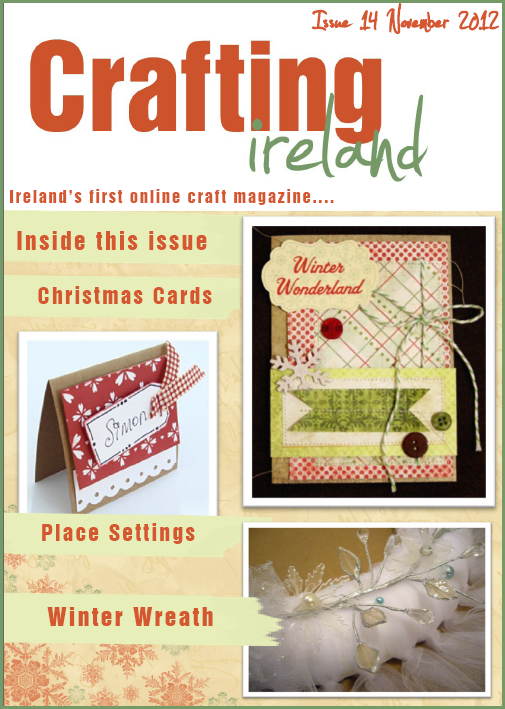
is out!
And I have a layout with a small step by step tutorial starting on page 12 :)
Here is a link to the magazine Issue 14!
They are also having a design team call which you can see on pages 4-5. The deadline for the call is January 14th. So if you are looking for a fun design team that only asks for two projects every six weeks, this is a good magazine to work for. Timi and Nicole really have a fantastic thing going here :)
Here is my two page winter layout being featured in the magazine. I go into a little more detail in the article. With all of the devastation and destruction I have seen caused by Hurricane Sandy, it makes the power outage from this ice storm in 2006 seem not so bad. Kind of puts things in perspective for me.
One of the things I love about designing for Crafting Ireland is that I am able to use product I have on hand to create my projects. So everything on this layout, with the exception of the gray striped washi tape at the bottom, has been in my scrapbook stash for a while! Love using all of that up :)
Tomorrow I will have a post up at Craft Your Nest and will be back here Thursday with another layout to share!


You are so good at two-page layouts, Mary Jo! I love how you captured the look and feel of an icy winter. Awesome work!
ReplyDeleteWow!!! This is GORGEOUS!!! LOVING the colors and the snowflakes!! And AWESOME on using up your stash!! I LOVE that feeling!!!!
ReplyDeletelove that 2 pager!! great job- love the colors
ReplyDeleteCongratulations on your gorgeous layout! I love that you can use up the stash in your room as a designer for them.
ReplyDeleteSuch a different take than many other design work gigs.
I am on a stash busting year in 2013. I have started already but will be fully geared up by New Years. Garage sales are open season as long as the prices are phenominal but store shopping other than adhesives, copic paper, and card weight cardstock, will be non consumables only!!! I could shop my sash for 15 years and still have product left. Oh my!!!
Gorgeous spread! The colors are perfect for your frosty photos, which are adorable BTW!
ReplyDeleteLove your layout!
ReplyDeleteAbsolutely beautiful layout! Love it!
ReplyDeleteLove the two-pager! It has just the right amount of sparkle so as not to take the focus off of your photos.
ReplyDeleteGorgeous layout. Perfect winter theme. Love the grid style, but then you broke it up with the word stickers.
ReplyDeleteI love the layout. The colors and feel are perfect for an ice storm!
ReplyDeleteI'm off to go check out your tutorial!
The layout looks awesome! Makes me want some hot chocolate too :)
ReplyDeleteLove all that blue. Beautiful photos and LO!
ReplyDeleteAwesome layout!!!
ReplyDeleteGorgeous 2 page layout, Mary Jo!
ReplyDeleteThis is a stunning layout.
ReplyDeleteI love the colours and the photography is outstanding.
As devastating as ice-storms are, they sure can be beautiful.
Great layout-I just love winter layouts!
ReplyDeleteOh my, makes me shiver just looking at your photos! What a winter wonderland! Great 2-pager too. Love the cool icy blues. :)
ReplyDeleteBeautiful layout - I love how the blue/gray just puts us in the wintery mood. The full size pictures are wonderful. You did a great job!
ReplyDeleteVery beautiufl two pager!!
ReplyDeleteLove the papers you used and the embellishments!
Love the picture and the title!!